The placement of the donation button is an important online fundraising topic, because it’s all about conversion – the donation completion that you have been working towards for a long time.
The following rule applies: A button must be clearly recognizable as such. Based on their experience, website visitors know that they have to click on a button in order to access a donation form, for example. Together with a direct call to action, buttons – usually better than text links or clickable images – motivate people to donate.
A donation button should not only be on the homepage, but on every page of the website. Your website is visited by new and returning visitors with different expectations and needs. You should provide appropriate information for both groups.
Read the following tips to help you place your donation buttons on the website and on your project pages.
Donation button for returning website visitors
When returning visitors come to the homepage of the website, they have often already decided to donate. They know your organization and your projects. They do not need any further information at the moment. All they need is the donation button, which takes them directly to the donation form.
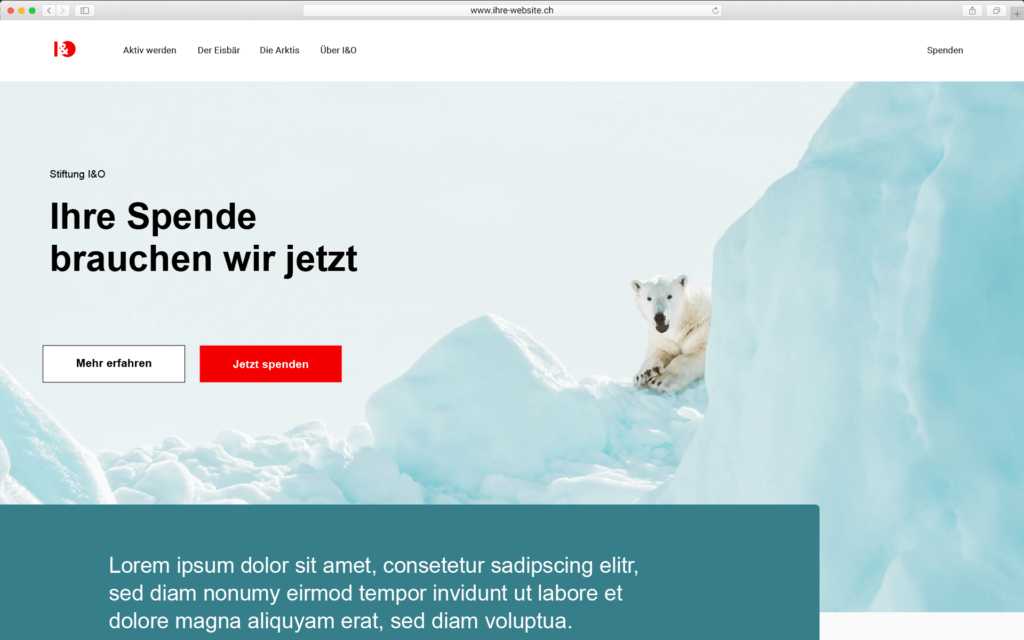
A donation button placed on the left takes into account the natural reading flow – from left to right. Eye-tracking studies show that we tend to look first to the left and then to the right. This is probably why many organizations place the logo on the left and the donation button on the right. How about positioning the logo and donation button on the left? Whatever the case may be. It is important that the donation button is immediately visible at the top of the visible part of the website and that your website is mobile optimized. Otherwise, a button placed on the right will not be visible.
Advantages of a prominently placed button on the first page of the website:
- The button quickly attracts attention.
- Short donation path: Website visitors click on the button, go directly to the donation form and can donate.
Disadvantages:
- This short donation route is not suitable for all website visitors.
- Some are not yet ready to donate. They need more information. That’s why it’s important to provide information and recommendations for both new and returning visitors.
Tip:
Check your website’s analytics to see how much traffic comes from mobile. Studies show that 40 to 50 percent of all page views in Switzerland are made via cell phones, and the trend is rising. A mobile-optimized website is therefore a must in order to offer visitors an optimal donation experience – a quick and easy donation.
For your orientation, check in Analytics how high the proportion of “new website visitors” and “returning visitors” is.
Donation button for new website visitors
For website visitors who are not yet ready to donate, so-called “triggers” are suitable, which indicate that your organization is dependent on donations. This can be a short sentence. Further information about your organization and your projects is also important. These people still need to build trust and want to be convinced. This is possible if they are guided accordingly on the website so that they learn more about your important project work and recognize why your organization is dependent on donations.
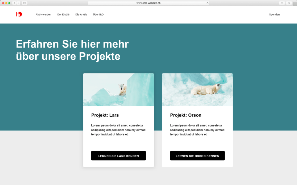
Teaser linked to the project page
Arouse the interest of these potential donors and place your most important content for fundraising, for example in the form of a teaser (from top to bottom: headline, short text and link to the project page) on your homepage – in the directly visible area of your website that is visible without scrolling. According to a study by the Nielsen Norman Group (2010-2018), this area receives almost 80 percent of visitors’ attention. Although they are now used to scrolling, you should still design this section on the homepage clearly so that your message is captured in just a few seconds and thus generates clicks on the link to the project page.
Button above and below
If the donation form is not already integrated on the project page, a button links to the donation form there. Place the donation button at the top of the project page, as this is where it is viewed most frequently. However, the lower part of the page should not be neglected either, as it is the second most frequently viewed part, as some users scroll straight down. Secondly, the button there reminds users once again: “You can donate”.
Text links support donation button
But caution is also advised: Too many donation buttons can reduce the likelihood of clicks. Studies show that a reduction to one prominently placed button can increase the click rate and also the fundraising result. If there are more than two calls to action on a page, only one button (maximum two) should attract the full attention of website visitors. The other calls to action can be text links. Although these are less attention-grabbing, they work if you integrate the link into the reading text. Linked texts should support the donation button and can also link to the donation form.
Advantages of buttons on the project page:
- Relevant information convinces website visitors, increases trust in the organization and leads to a donation request or confirms it.
- Donation buttons at the top and bottom cover the two most important and most frequently viewed areas of the page.
Disadvantages:
- The donation button is not visible on the start page, but only on a subsequent page, e.g. the project page.
- It may take several clicks to get to the donation form.
Tip:
On the project page, the page content, which is divided into differently arranged columns, can increase visitors’ attention and motivate them to scroll, read and click. With good text, they want to discover even more on the page and continue reading.
You can also give website visitors a better orientation by providing a short example of what can be financed with a specific donation amount, for example: With 30 francs you can finance xy.
Checklist: Place donation button
- Use a donation button because it speeds up the donation process.
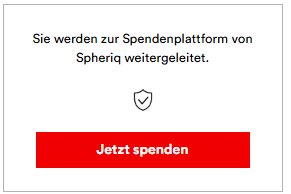
- Link the donation button directly to the donation form or to a page of your organization or project portrait on spheriq.ch with the donation form embedded there.
- Both new and returning visitors come to your website. Take a look at your website’s analytics to see how high the respective percentage is.
- Place the donation button prominently on your homepage in the upper visible area so that website visitors who have already decided to donate can see it directly.
- Visitors who want to get to know your organization first will be directed to a page with more information about the project.
- Integrate the donation button prominently at the top and bottom of your project page.
- You increase the click result if you integrate one or a maximum of two buttons on a page.
- Further calls to action should be created as text links that support the donation button and, if necessary, also link to the donation page.
Read more on the topic: “Donation button texts that work”
Build up your digital fundraising
Accelerate the completion of donations. Create calls to action that suit your target group with Spheriq:
- Place a donation button on your website that links to your organization and project portrait on the Spheriq donation platform.
- Or integrate a donation form directly on your website. This allows you to collect digital donations from private individuals and patrons without any detours.
In both cases, fundraising is free of charge up to an amount of CHF 10,000 – there are no additional fees!
Are you interested in our offer for fundraisers?